Visualizing Learning Curves
We have seen how results from many experiments can be visualized jointly in order to compare different HPO methods, different variations of the benchmark (e.g., different configuration spaces), or both. In order to understand differences between two setups in a more fine-grained fashion, it can be useful to look at learning curve plots. In this section, we demonstrate Syne Tune tooling along this direction.
Why Hyper-Tune Does Outperform ASHA?
In our docs-1 study, HYPERTUNE-INDEP significantly outperforms ASHA.
The best metric value curve descends much faster initially, and also the final
performance at max_wallclock_time is significantly better.
How can this difference be explained? Both methods use the same scheduling logic,
so differences are mostly due to how configurations of new trials are suggested.
In ASHA, this is done by random sampling. In HYPERTUNE-INDEP, independent
Gaussian process surrogate models are fitted on observations at each rung level,
and decisions are made based on an acquisition function which carefully weights
the input from each of these models (details are given
here). But how exactly does
this difference matter? We can find out by plotting learning curves of trials
for two experiments next to each other, ASHA on the left, HYPERTUNE-INDEP`
on the right. Here is the code for doing this:
Here is the code for generating result plots for two of the benchmarks:
from typing import Dict, Any, Optional

from syne_tune.experiments import (
    TrialsOfExperimentResults,
    PlotParameters,
    MultiFidelityParameters,
)
from benchmarking.examples.benchmark_hypertune.benchmark_definitions import (
    benchmark_definitions,
)


SETUPS_TO_COMPARE = ("ASHA", "HYPERTUNE-INDEP")


def metadata_to_setup(metadata: Dict[str, Any]) -> Optional[str]:
    algorithm = metadata["algorithm"]
    return algorithm if algorithm in SETUPS_TO_COMPARE else None


if __name__ == "__main__":
    experiment_name = "docs-1"
    benchmark_name_to_plot = "nas201-cifar100"
    seed_to_plot = 7
    download_from_s3 = False  # Set ``True`` in order to download files from S3

    experiment_names = (experiment_name,)
    # Plot parameters across all benchmarks
    plot_params = PlotParameters(
        xlabel="wall-clock time",
        grid=True,
    )
    # We need to provide details about rung levels of the multi-fidelity methods.
    # Also, all methods compared are pause-and-resume
    multi_fidelity_params = MultiFidelityParameters(
        rung_levels=[1, 3, 9, 27, 81, 200],
        multifidelity_setups={name: True for name in SETUPS_TO_COMPARE},
    )
    # The creation of ``results`` downloads files from S3 (only if
    # ``download_from_s3 == True``), reads the metadata and creates an inverse
    # index. If any result files are missing, or there are too many of them,
    # warning messages are printed
    results = TrialsOfExperimentResults(
        experiment_names=experiment_names,
        setups=SETUPS_TO_COMPARE,
        metadata_to_setup=metadata_to_setup,
        plot_params=plot_params,
        multi_fidelity_params=multi_fidelity_params,
        download_from_s3=download_from_s3,
    )

    # Create plot for certain benchmark and seed
    benchmark = benchmark_definitions[benchmark_name_to_plot]
    # These parameters overwrite those given at construction
    plot_params = PlotParameters(
        metric=benchmark.metric,
        mode=benchmark.mode,
    )
    results.plot(
        benchmark_name=benchmark_name_to_plot,
        seed=seed_to_plot,
        plot_params=plot_params,
        file_name=f"./learncurves-{experiment_name}-{benchmark_name_to_plot}.png",
    )
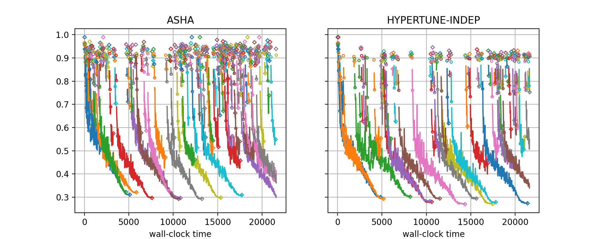
The figure for benchmark nas201-cifar-100 and seed=7 looks as follows:
|
|---|
Learning curves for NASBench-201 (CIFAR-100), |
The class for creating learning curve plots is
TrialsOfExperimentResults. It is quite similar
to ComparativeResults, but there are differences:
For learning curve plots, each setup occupies its own subfigure. Also, the seed for each plot is fixed, so each subfigure is based on the results for a single experiment.
metadata_to_setupis used to filter out the experiments we want to compare. In this case, this isASHAandHYPERTUNE-INDEP.The default for
plot_params.subplotsis a single row of subfigures, one for each setup, and titles correspond to setup names. In our example, we use this default. If you want to compare many setups, you can use an arrangement with multiple rows as well.In learning curve plots, the trajectory of metric values for a trial is plotted in a different color per trial (more precisely, we circle through a palette, so that eventually colors are repeated). The final metric value of a trial is marked with a diamond.
If comparing multi-fidelity methods (like ASHA, Hyper-Tune, MOBSTER), you should also specify
multi_fidelity_params, passing the rung levels. In this case, metric values at rung levels are marked by a circle, or by a diamond if this is the final value for a trial.If some of your multi-fidelity setups are of the pause-and-resume type (i.e., the evaluation of a trial can be paused and possibly resumed later on), list them in
multi_fidelity_params.pause_resume_setups. Trajectories of pause-and-resume methods need to be plotted differently: there has to be a gap between the value at a rung level and the next one, instead of a line connecting them. In our example, all setups are pause-and-resume, and these gaps are clearly visible.
What do these plots tell us about the differences between ASHA and
HYPERTUNE-INDEP? First of all, HYPERTUNE-INDEP has many less isolated
diamonds than ASHA. These correspond to trials which are paused after one
epoch and never resumed. For ASHA, both the rate of single diamonds and
their metric distribution remains stationary over time, while for
HYPERTUNE-INDEP, the rate rapidly diminishes, and also the metric values
for single diamonds improve. This is what we would expect. ASHA does not
learn anything from the past, and simply continues to suggest configurations
at random, while HYPERTUNE-INDEP rapidly learns what part of the
configuration to avoid and does not repeat basic mistakes moving forward. This
means that overall, ASHA wastes resources on starting poorly performing
trials over and over, while HYPERTUNE-INDEP uses these resources in order
to resume training for more trials, thereby reaching better performances over
the same time horizon. These results were obtained in the context of simulated
experimentation, without delays for starting, pausing, or resuming trials. In
the presence of such delays, the advantage of model-based methods over ASHA
becomes more pronounced.
With specific visualizations, we can drill deeper to figure out what
HYPERTUNE-INDEP learns about the configuration space. For example, the
configurations of all trials are stored in the results as well. Doing so, we
can confirm that HYPERTUNE-INDEP rapidly learns about basic properties of
the NASBench-201 configuration space, where certain connections are mandatory
for good results, and consistenty chooses them after a short initial phase.