Visualization of Results
As we have seen, Syne Tune is a powerful tool for running a large number of experiments in parallel, which can be used to compare different tuning algorithms, or to split a difficult tuning problem into smaller pieces, which can be worked on in parallel. In this section, we show how results of all experiments of such a comparative study can be visualized, using plotting facilities provided in Syne Tune.
Note
This section offers an example of the plotting facilities in Syne Tune. A more comprehensive tutorial is here.
A Comparative Study
For the purpose of this tutorial, we ran the setup of benchmarking/examples/benchmark_hypertune/, using 15 random repetitions (or seeds). This is the command:
python benchmarking/examples/benchmark_hypertune/launch_remote.py \
  --experiment_tag docs-1 --random_seed 2965402734 --num_seeds 15
Note that we fix the seed here in order to obtain repeatable results. Recall from here that we compare 7 methods on 12 surrogate benchmarks:
Since 4 of the 7 methods are “expensive”, the above command launches
3 + 4 * 15 = 63remote tuning jobs in parallel. Each of these jobs runs experiments for one method and all 12 benchmarks. For the “expensive” methods, each job runs a single seed, while for the remaining methods (ASHA, SYNCHB, BOHB), all seeds are run sequentially in a single job, so that a job for a “cheap” method runs12 * 15 = 180experiments sequentially.The total number of experiment runs is
7 * 12 * 15 = 1260Results of these experiments are stored to S3, using paths such as
<s3-root>/syne-tune/docs-1/ASHA/docs-1-<datetime>/for ASHA (all seeds), or<s3-root>/syne-tune/docs-1/HYPERTUNE-INDEP-5/docs-1-<datetime>/for seed 5 of HYPERTUNE-INDEP. Result files aremetadata.json,results.csv.gz, andtuner.dill. The former two are required for plotting results.
Once all of this has finished, we are left with 3780 result files on S3. We will now show how these can be downloaded, processed, and visualized.
Visualization of Results
First, we need to download the results from S3 to the local disk. This can be
done by a command which is also printed at the end of launch_remote.py:
aws s3 sync s3://<BUCKET-NAME>/syne-tune/docs-1/ ~/syne-tune/docs-1/ \
  --exclude "*" --include "*metadata.json" --include "*results.csv.zip"
This command can also be run from inside the plotting code. Note that the
tuner.dill result files are not downloaded, since they are not needed for
result visualization.
Here is the code for generating result plots for two of the benchmarks:
from typing import Dict, Any, Optional
import logging

from baselines import methods
from benchmark_definitions import benchmark_definitions
from syne_tune.experiments import ComparativeResults, PlotParameters, SubplotParameters


def metadata_to_setup(metadata: Dict[str, Any]) -> Optional[str]:
    # The setup is the algorithm. No filtering
    return metadata["algorithm"]


SETUPS_RIGHT = ("ASHA", "SYNCHB", "BOHB")


def metadata_to_subplot(metadata: Dict[str, Any]) -> Optional[int]:
    return int(metadata["algorithm"] in SETUPS_RIGHT)


if __name__ == "__main__":
    logging.getLogger().setLevel(logging.INFO)
    experiment_name = "docs-1"
    experiment_names = (experiment_name,)
    setups = list(methods.keys())
    num_runs = 15
    download_from_s3 = False  # Set ``True`` in order to download files from S3
    # Plot parameters across all benchmarks
    plot_params = PlotParameters(
        xlabel="wall-clock time",
        aggregate_mode="iqm_bootstrap",
        grid=True,
    )
    # We would like two subplots (1 row, 2 columns), with MOBSTER and HYPERTUNE
    # results on the left, and the remaining baselines on the right. Each
    # column gets its own title, and legends are shown in both
    plot_params.subplots = SubplotParameters(
        nrows=1,
        ncols=2,
        kwargs=dict(sharey="all"),
        titles=["Model-based Methods", "Baselines"],
        legend_no=[0, 1],
    )
    # The creation of ``results`` downloads files from S3 (only if
    # ``download_from_s3 == True``), reads the metadata and creates an inverse
    # index. If any result files are missing, or there are too many of them,
    # warning messages are printed
    results = ComparativeResults(
        experiment_names=experiment_names,
        setups=setups,
        num_runs=num_runs,
        metadata_to_setup=metadata_to_setup,
        plot_params=plot_params,
        metadata_to_subplot=metadata_to_subplot,
        download_from_s3=download_from_s3,
    )
    # We can now create plots for the different benchmarks
    # First: nas201-cifar100
    benchmark_name = "nas201-cifar100"
    benchmark = benchmark_definitions[benchmark_name]
    # These parameters overwrite those given at construction
    plot_params = PlotParameters(
        metric=benchmark.metric,
        mode=benchmark.mode,
        ylim=(0.265, 0.31),
    )
    results.plot(
        benchmark_name=benchmark_name,
        plot_params=plot_params,
        file_name=f"./{experiment_name}-{benchmark_name}.png",
    )
    # Next: nas201-ImageNet16-120
    benchmark_name = "nas201-ImageNet16-120"
    benchmark = benchmark_definitions[benchmark_name]
    # These parameters overwrite those given at construction
    plot_params = PlotParameters(
        metric=benchmark.metric,
        mode=benchmark.mode,
        ylim=(0.535, 0.58),
    )
    results.plot(
        benchmark_name=benchmark_name,
        plot_params=plot_params,
        file_name=f"./{experiment_name}-{benchmark_name}.png",
    )
The figure for benchmark nas201-cifar-100 looks as follows:
|
|---|
Results for NASBench-201 (CIFAR-100) |
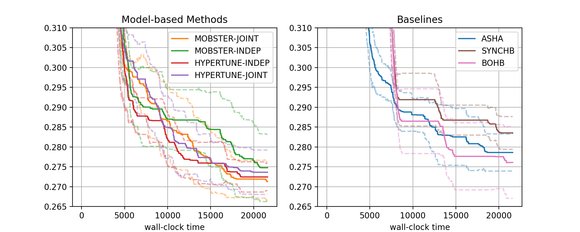
There are two subfigures next to each other. Each contains a number of curves in bold, along with confidence intervals. The horizontal axis depicts wall-clock time, and on the vertical axis, we show the best metric value found until this time.
More general, the data from our 1260 experiments can be grouped w.r.t. subplot, then setup. Each setup gives rise to one curve (bold, with confidence band). Subplots are optional, the default is to plot a single figure.
The function
metadata_to_setupmaps the metadata stored for an experiment to the setup name, or toNoneif this experiment should be filtered out. In our basic case, the setup is simply the name of the tuning algorithm. Our benchmarking framework stores a host of information as metadata, the most useful keys for grouping are:algorithm: Name of method (ASHA,MOBSTER-INDEP, … in our example)tag: Experiment tag. This isdocs-1in our example. Becomes useful when we merge data from different studies in a single figurebenchmark: Benchmark name (nas201-cifar-100, … in our example)n_workers: Number of workers
Other keys may be specific to
algorithm.Once the data is grouped w.r.t. benchmark, then subplot (optional), then setup, we should be left with 15 experiments, one for each seed. Each seed gives rise to a best metric value curve. A metric value
metric_valis converted asmetric_multiplier * metric_valifmode == "min", and as1 - metric_multiplier * metric_valifmode == "max". For example, if your metric is accuracy in percent (from 0 to 100), thenmode="max"andmetric_multiplier=0.01, and the curve shows error in [0, 1]. However, ifconvert_to_min == False,metric_valis always converted asmetric_multiplier * metric_val, so that larger is better ifmode == "max".These 15 curves are now interpolated to a common grid, and at each grid point, the 15 values (one for each seed) are aggregated into 3 values
lower,aggregate,upper. In the figure,aggregateis shown in bold, andlower,upperin dashed. Different aggregation modes are supported (selected byplot_params.aggregate_mode):mean_and_ci: Mean and 0.95 normal confidence intervaliqm_bootstrap(default): Interquartile mean and 0.95 confidence interval based on the bootstrap variance estimate. These statistics are argued for in Agarwal et.al: Deep Reinforcement Learning at the Edge of the Statistical Precipice.median_percentiles: Median and 25 (lower), 75 (upper) percentiles
Plotting starts with the creation of a
ComparativeResultsobject. We need to pass the experiment names (or tags), the list of all setups, the number of runs (or seeds), themetadata_to_setupfunction, as well as default plot parameters inplot_params. SeePlotParametersfor full details about the latter. In our example, we setxlabel,aggregate_mode(see above), and enable a grid withgrid=True. Note that these parameters can be extended and overwritten by parameters for each plot.In our example, we separate the MOBSTER and HYPERTUNE setups from the baselines, by using two subfigures. This is done by specifying
plot_params.subplotsandmetadata_to_subplot. In the former,plot_params.subplots.nrowsandplot_params.subplots.ncolsare mandatory, providing the shape of the subplot arrangement. Inplot_params.subplots.titles, we can provide titles for each column (which we do here). If given, this overridesplot_params.title. Also,plot_params.subplots.legend_no=[0, 1]asks for legends in both subplots (the default is no legend at all). For full details about these arguments, seeSubplotParametersThe creation of
resultsdoes a number of things. First, ifdownload_from_s3=True, result files are downloaded from S3. In our example, we assume this has already been done. Next, all result files are iterated over, allmetadata.jsonare read, and an inverse index from benchmark name to paths,setup_name, andsubplot_nois created. This process also checks that exactlynum_runsexperiments are present for every setup. For large studies, it frequently happens that too few or too many results are found. The warning outputs can be used for debugging.Given
results, we can create plots for every benchmark. In our example, this is done fornas201-cifar100andnas201-ImageNet16-120, by callingresults.plot(). Apart from the benchmark name, we also pass plot parameters inplot_params, which extend (and overwrite) those passed at construction. In particular, we need to passmetricandmode, which we can obtain from the benchmark description. Moreover,ylimis a sensible range for the vertical axis, which is different for every benchmark (this is optional).If we pass
file_nameas argument toresults.plot, the figure is stored in this file.
Note
Apart from plots comparing different setups, aggregated over multiple seeds, we can also visualize the learning curves per trial for a single experiment. Details are given in this tutorial.